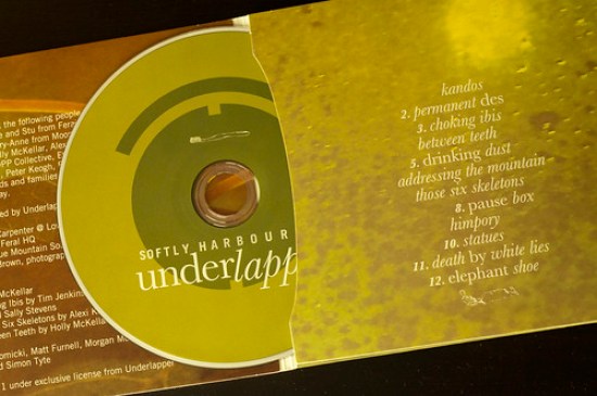
Underlapper – Softly Harboured Artwork
Underlapper‘s latest album, Softly Harboured was released this week and I was lucky enough to be asked to do the artwork for physical CD release. It was a lesson in quick turnaround though, as both myself and the band were under pressure to get this out into the wild as soon as possible. Have a listen as you read on…
%CODE1%
Real artwork has never been my strong suit. I can’t draw and behind a camera, good images usually come from serendipity more than anything else. I feel much more comfortable in the world of layout and typography. And so instead of banging my head against the wall, I took the sensible option of using the images of a Flickr photographer who generously licenses her images under Creative Commons. The following are from the ultra talented D Sharon Pruitt/Pink Sherbet Photography…


I really let these images guide the entire layout. I had an idea of the tone I was after before I started looking through photos on Flickr, and knew immediately that these were what I was after. I did seem to unconsciously draw on my inner 4AD nerd for this one and I ended up with more or less the final design right off the bat…


So really not a lot of change in terms of graphics, just layout. Specifically, the band were concerned that the front cover was too bland to begin with: it will be used alone as the digital image (think about how all your music is represented in iTunes), so the photograph needed to be reversed. As a design choice I would have kept it as it was originally, but we do need to think about the iChildren.
Although it was a speedy job, all things considered, I’m fairly happy with the result. I would have liked the chance to do a print proof and some more work on the back cover though. What I am happy about is the tone I got from the images and type. When I listen to Underlapper’s music, I feel as though it’s a very personal expression for them. Yet the challenge for most (not all) music is to somehow turn the personal into universal.
And so I aimed to present that same idea: what is it that we keep close and still everyone can associate with? Toiletries. It’s probably a bit absurd, but let’s face it, so are most of the things we take seriously. Something hand-drawn connected the graphics with the strongly organic imagery, and a toothbrush/toothpaste/hairbrush seemed to fit in quite nicely.
So here it is – a real, physical design. Something that I get to do precious little of these days…

